Make your point with style
A bullet-pointed list is a typographic expression which is meant to make an argument easier to read and understand, by dividing the text into compact sentences which are initiated by a point. The purpose of the point is to “lead the eye” into the text and help...
Identifying colors
Colors, like people, need to be identifiable. We need to know “who they are”. People are identified by their date of birth and some kind of personal number (depending on which country you live in). Colors are identified by COLOR CODES. The main purpose of color codes...
Dreaming of a red Christmas
This time of the year I “usually” write a blog post or newsletter about the color red. This is of course because the color surrounds us everywhere in December. I love all the white nuances outdoors (at least in my parts of the world), but they are...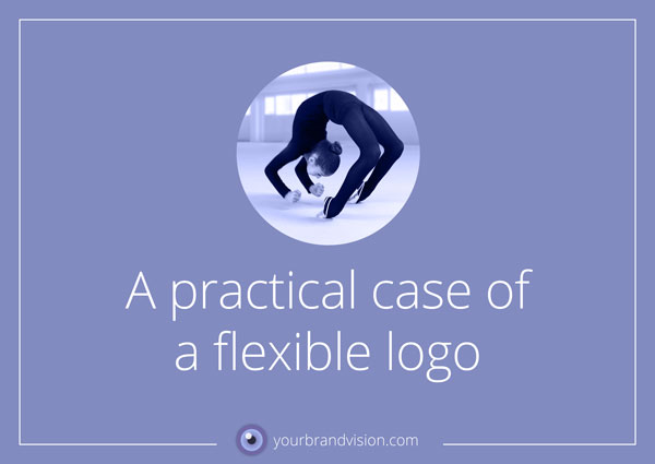
A practical case of a flexible logo
In my last blogpost I talked about flexible logos. I promised that I would return to the subject with examples, which I do now. This time it is also about how we all have to jump, when Facebook calls “JUMP”. This is when it comes in handy to have a flexible logo and a...Is your logo flexible?
In the good old days, logos were often very intricate things. They could contain titles, texts, the year the business was founded and lots of other information. The heritage from Heraldry was strong and there were shields and vines galore. These logos were more like...Optin
DO YOU FEEL
LOGO-SHAME?
Download this free guide
where I reveal
the design process
top business owners
are using to get a logo
you truly love &
can be proud of!
Coffee Date