A bullet-pointed list is a typographic expression which is meant to make an argument easier to read and understand, by dividing the text into compact sentences which are initiated by a point. The purpose of the point is to “lead the eye” into the text and help distinguish one point from another. Bullet pointed lists are great for listing short, clear facts.
You may also have seen so-called “lead-words” used in newspaper and magazine texts. These are 1-3 words at the start of a paragraph which are set in a bolder style and perhaps in color. They serve the same purpose as bullet points.
In bullet-pointed lists, we should aim to use more white space between each point. This makes it very easy, even on a distance, to distinguish between the different points in a list. What belongs together is placed together and is set apart from other things by using white space.
The most common text-editor known to woman MAY have settings that make it possible to follow these very simple guidelines for setting bullet-pointed lists. However, the default settings in the program, which nobody bothers to change, are NOT optimal for creating lists that are easy to read. Because the program, with its less fortunate settings, is so widely used, its “list-look” has become somewhat of a standard. The result is that we are surrounded by bullet-pointed lists that lack readability and ability to be REMEMBERED.
Look at the two lists below:
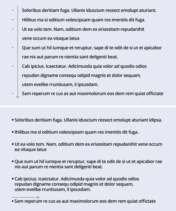
In the first one, the bullet points, which are supposed to “lead the eye” are all too tiny. They are left to themselves in an ocean of white space and do not lead the eye neither here nor there. However, thanks to the long distance between the point and its text, a wide white street emerges vertically, leading the eye out of the list altogether. In this list the line height and the space between bullet-pointed texts are identical, we get no help from space to distinguish between the bullet points. When points have more than 1 line, it is very difficult to see at a glance where one point ends and the next begins.
In the second list, the points themselves are big enough to really catch the eye. The distance between the point and its text is so short that the eye literally jumps into the text – which is what is supposed to happen. After a point is finished, plenty of white space is used to set it apart from the next. The line-height and the space between points are NOT identical.
The second list is easier to read and remember.
Two more tips on creating lists:
If you consequently find yourself writing lists where every point turns out to be 3 lines or more, you are NOT writing lists, but paragraphs. Keep things short and compact, or choose another format for your text.
Never use your logo or any part thereof as bullet points in lists! The logo is a visual means on a much higher level than bullet points! If you want to brand your bullets, create them in your brand color or have a designer create some for you that has a shape that is unique for your business.
Need help with bullet-pointed lists or other typographic issues? I would love to help you.


Great advice, Hanne! Thanks for showing me the difference between the two bullet lists, it’s pretty dramatic!