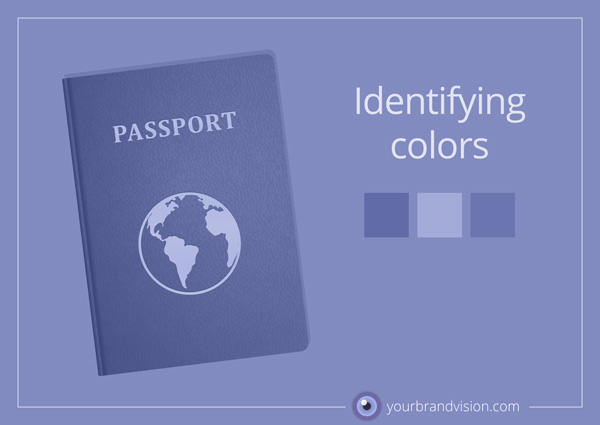
Colors, like people, need to be identifiable. We need to know “who they are”. People are identified by their date of birth and some kind of personal number (depending on which country you live in). Colors are identified by COLOR CODES. The main purpose of color codes is to make it possible to reproduce the exact same color over and over again. Color codes are pretty strict things. It is not sufficient to use a name, like teal, strawberry red or maroon, because different people may have very different interpretations of such a description. A color code doesn’t leave anything to personal interpretation. It’s like a physical formula.
Before personal computers and television, people experienced colors via printed materials, art and nature itself. Today we primarily experience color via computer screens. Colors are produced on screens by using light. There are three different light sources or “lamps”: one red R, one green G, and one blue B. Different amounts of light from these sources will blend to your eye and create all the colors which are possible to produce in the so-called RGB color-space. To describe to a browser (like Chrome or Safari) which “lamps” to turn on and off to produce a particular color, the so-called hexadecimal color codes are used. You know, those with a #-sign in front of them?
Still, we have to print something now and then. Perhaps we buy an ad in a magazine or want to print a poster for our next event. Presenting the hexadecimal web color codes to a 4-color printing press won’t do. It’s greek to them. In print we use CMYK-codes, which relates to 4 different print colors. These colors mix on the paper in a way that makes your eyes perceive them as a lot of different colors. The total number of colors that can be produced this way make up what we call the CMYK color-space.
To describe your brand colors you need these codes:
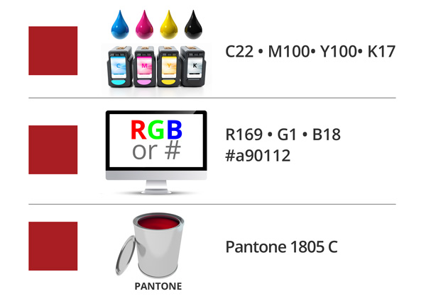
Pantone color is a bucket-style of printing, where one color is mixed in a bucket prior to printing, like when you go out and buy paint to redecorate your kitchen.
IMPORTANT: To compare the results of these different ways of creating colors is in fact like comparing apples and oranges.
Colors produced with a light on a screen are far more vibrant and shiny than printed color can ever be. Mixing of light and mixing of inks or dyes cannot produce the same results.
A fantastic color found on a screen can unfortunately never be rendered 100% the same in print.
When deciding on a CMYK version of an RGB-color what we do is compromise. We define and name the CMYK version knowing that this is the CMYK equivalent of the RGB screen color. Knowing this, we avoid disappointment when receiving the printed item.
If you need help to choose and describe your brand’s colors by correct color codes for screen and print, please let me know. I would love to help out!