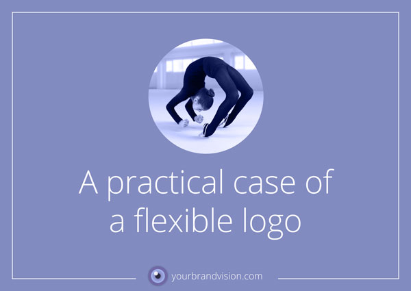
In my last blogpost I talked about flexible logos. I promised that I would return to the subject with examples, which I do now. This time it is also about how we all have to jump, when Facebook calls “JUMP”. This is when it comes in handy to have a flexible logo and a flexible attitude.
In 2014, I started to work with Yvonne and Nalle Helsén in their Swedish company “Idésupport AB” and if you think this means Idea Support, you are perfectly correct. “Idésupport AB” needed to redesign their website and have their visual profile sharpened. One of the things that were needed was a Facebook Fan Page.
Their logo looked like this when we started. Yvonne and Nalle were very happy with their logo and did not want to have it redesigned. However, they completely understood that the logo might need some modifications to make it fit into diverse new media such as Facebook and others.
To make it clearer on what they were actually helping businesses with, we added a payoff to the logo. “Idea Support” is quite an open name and does not tell exactly in what way and how the firm contributes to their clients with ideas and support. The payoff we added reads; “Tools for your business growth” in English and so it all became quite clear. Yvonne and Nalle help businesses grow! For the Facebook Fan Page, it was self-evident that we had to do something to the logo. Trying to put the big oblong thing into the format of the Facebook Profile Image, which at that time was a square, would make the logo tiny and unclear even in the largest version of the profile image, which is what you see when visiting the page itself.
The fact that the Profile Picture is rendered in 2 more versions, both of which are smaller than the first (one when you post something yourself and an even smaller one when you comment on someone else’s posts) made it even more necessary to make a “Facebook-friendly” version of the logo.
I made this one, which looked quite readable even in the smallest versions:
Then, one day we wake up and discover that Facebook has changed its Profile Pictures to circles! This does not entirely kill our Facebook logo, but because the content is pushed together inside the circle, it is hard to read the “SUPPORT AB” text underneath the red “IDÉ” sign. There is a thin grey border on the circular image. We avoid crashing with the border only by a hairs width. This is when we are grateful that Facebook provides the full name of the business alongside the Profile Picture every time we post something. This means that with the very limited space inside the circle, we don’t need to struggle to have the name of the business inside it as well.
The image that you will upload to Facebook for the Profile Picture should still
be a square one, but it is shown on the page through a circular “hole”.
From a typographic-nerdish viewpoint there are still some tiny adjustments I would like to do to the word IDÉ inside the circle, but I will come back to them:)
If you have a logo that needs a “facelift” or some modifications to make the best of itself in diverse digital media, please let me know, and we’ll fix it! It is a challenge to know where to start, if you want to work with the visual branding and graphic design for your business. Let’s have a talk on Skype or telephone to see how I can help you, starting at the point you’re at right now. I am curious about what you have to say. There is no cost for this call. Book a call by sending me an e-mail on: hanne@yourbrandvision.com