Fonts are different. We know this, of course, and that is why we choose one font for something and another font for something else. Fonts have contrasting stylistic attributes. I usually say that fonts say more than the words that have been set with them. We will certainly dive deeper into THAT in later newsletters and blog posts.
Here and now I am going to talk about font-sizes. This is an area where size really matters!
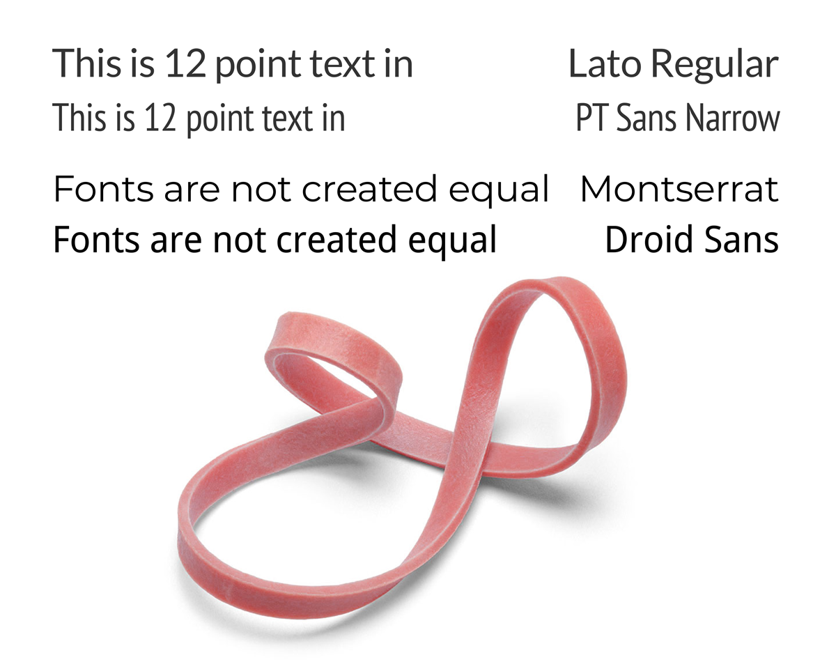
Have you ever been asked to deliver a text somewhere and it is said that it should be in 12 point size? This is NOT a precise indication of a font-size! Something crucially important is missing from the equation. We need to know WHICH FONT you are talking about.
Fonts were not created equal. They vary in many ways, even within the same “font-size”.
• Some fonts have a very low x-height, which is the height of the lowercase letters in the font.
• Some fonts have long descenders, i.e the part of a character (g, j, p, q, y) that descends below the baseline. This requires more line height in the text.
• Some fonts are very wide (these are in vogue just now), while other fonts are narrow. Obviously, you will get more of the latter into one line than the former. (Like you would get more thin people into an elevator than fat people)

Text is a very flexible matter. You may think of text like a rubber band.
It is impossible to know how long a text will stretch until we have decided:
• Which font we will use
• Which font-size we will use
• Which line-height we will use
If you need help to design and layout a text for a book, an e-book, a brochure or advertisement, I would love to help you. Book a free virtual coffee-date and let us chat about your texts and see if I can help.


