Quotes are very much in vogue. Not just in E-books and presentations, but also on websites and especially on Social Media. What I find remarkable when people use quotes, is that they seem to forget that they are NOT setting text on an old-fashioned typewriter. They are in fact totally independent and free to shape or design their quotes any way they like, to make them pleasant to look at.
In modern type setting software we are free to break the lines where ever we find it meaningful and visually appealing. We should use this freedom more.
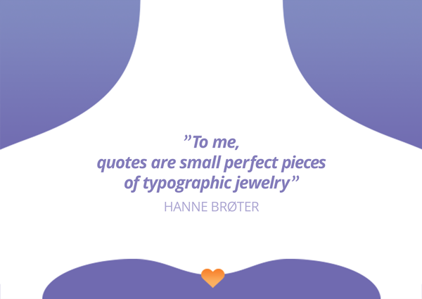
I consider quotes to be “word-jewelry”, not only by virtue of their verbal content, but also by how they can be designed to let the shape and typography of the group of words support the statement.
Look at the meaning of the sentence(s) and break the lines according to the meaning as far as possible. Let the lines fall like you hear them when they are spoken. Don’t break the flow of the sentence.
It IS possible to get nice results by left- or right aligning the word group. However, this can be at bit challenging for the novice typographer 🙂 A centered solution is much safer. In most cases it gives a very balanced result that can be placed for instance in the right margin of an E-book, in the center of a Power Point slide or centered on the format of a Social Media Post Image.
Let the quote be at least 2 or 3 lines. Never just one. A longer middle line supported by 2 shorter lines under and over, tends to look balanced, but let the meaning of the words decide this. There are no rules set in stone (no pun intended) for this, use your EYES and try to make a pleasing little group of the words;
a typographic piece of jewelry. FROM RUNNING TEXT TO DESIGNED QUOTE
Upper example:
Here the text has just been typed out without any attempt on design.
Lower example:
- Center the text.
- Break the lines according to the meaning and flow of the sentence(s)
- Italic usually looks good on quotes and try to bold it up a bit to let it stand out on the page as an independent entity.
- Keep the lines together! Quotes require less line height.
- If the quotation marks of your font look un-decorative and dull,
borrow some from another font! Adjust the size of the quotation marks independently from the text size to get a nice result. - The name of the quoted person is not part of the quote, and so should not be designed in the same manner. Use contrast:
– Upper case vs. lower case,
– Regular straight letters vs. italic,
– Another “color”, in this example it is another tint of black.
Text: 90% black, author: 50% black, or use your brand colors.
Good Luck on your quote-design!! It is a challenge to know where to start, if you want to work with the visual branding and graphic design for your business. Let’s have a talk on Skype or telephone to see how I can help you, starting at the point you’re at right now. I am curious about what you have to say. There is no cost for this call. Book a call by sending me an e-mail on: hanne@yourbrandvision.com