Does your logo disappear?

These days we have to upload our logos everywhere. There are social media sites (of course,) online teaching platforms, communities, and membership sites.
Often, the place allotted to the user’s logo is tiny. The final uploaded result is discouraging; the logo seems to “disappear.” Maybe you have experienced this or seen other people’s logos look more like weird insects in the allotted logo space. On some channels and platforms, the logo is rendered in 2-3 even smaller sizes, ending up looking like a virus.
What can we do about this?
1. First, check the logo file itself.
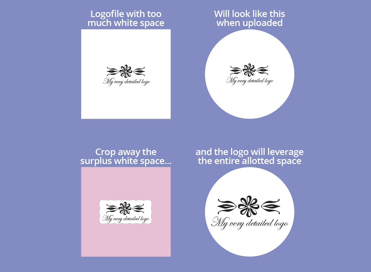
If you have a very detailed logo, it is important that the file you are uploading does not include a lot of white space around the logo itself. The system that receives the logo cannot distinguish between the logo and the white space. The total amount of pixels in the file is considered “the logo” and rendered on the front end. In these cases, crop the logo file to contain just the logo and little white space. On some channels (but not everywhere,) you can crop the image during the upload as a part of the process. If not, the logo has to be cropped first in photo-editing software.

2. Often, the box allotted to the uploaded logo is square or almost square. If you have an oblong logo, it tends to look like a small worm in the logo box.
If your logo has a clear icon and a long name, the solution can be to skip the name and only use the icon. You can get help from a graphic designer to “cut loose” the icon and save it as a separate file which leverages the area of the allotted box much better. Almost as a rule, the channel or platform will display the name of your business next to the logo box anyway, so there is no need to include it in your upload.

3. If you have an old, oblong, AND detailed logo that cannot split into the icon + name, my strong recommendation is to start out from scratch and have a new logo designed, which meets the requirements of a modern, digital logo. Check your logo across these parameters:
• Will your logo look OK even in tiny sizes on a screen?
• Will your logo lose its meaning if rendered in one color only?
• Can your logo be divided into parts that can do the branding work individually? If you don’t get what I am talking about here, think of NIKE. They have a logo (NIKE,) a swoosh that everybody recognizes, and a tagline (Just Do It) which are being used individually or in different combinations across all their products and marketing.

This illustration is from my book BRAND BOXES, where you can read more about logos and visual branding. If you are on LinkedIn, check out this carousel post about what we did with Judy Kane’s logo, which also tended to “disappear” in some circumstances.
You are also welcome to have a logo chat with me.


