Why ONE-BIT
I have written and spoken about the importance of ONE-BIT logos more times than I can remember. You probably don’t either, so let’s venture on a small repetition:
What is a ONE-BIT logo? It is a logo that, if necessary, can be rendered in one color only, without losing its meaning. Practically speaking, this means that the parts of the logo have to be separated by white, or space, or “nothingness”. You may think of a one-bit logo as a stamp.
There are several reasons that you should have a ONE-BIT logo.
Being a stamp, the logo is in reality exactly the same as a letter-form. All our letterforms are stamps. A ONE-BIT logo icon will have a clear visual connection to the letters of the logo. This will be delightful to our eyes and logical sense, even if you cannot explain why.
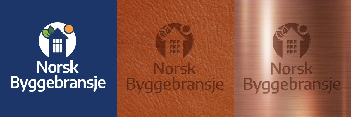
Another reason is that with its clearly defined shapes, a ONE-BIT logo can be cut from metal, embossed in leather, or milled into different materials.

If your logo is an intricate drawing, where the colors are placed back to back without being separated by white, you cannot do any of these things with it. And it will look like what it is; a drawing next to a name.
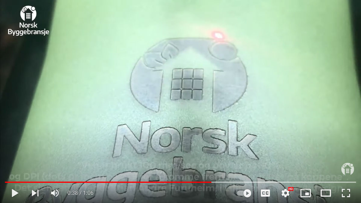
I have never had a better demonstration of the importance of having a ONE-BIT logo than in this video from Norsk Byggebransje. Click the image below to watch the video, and you will see what I mean.
I’ve acquired a very valuable tool in the shape of this video. It will help me every time I try to explain to a new logo-owner the importance of ONE-BIT. This explanation is part of the logo brief I do with everybody who wishes me to make a new logo for them. I also explain all the other requirements that exist for a modern, digital logo. This will ensure they get a very flexible identity mark that can do the heavy brand lifting on every surface where we need to be present with our marketing, both in print and digitally. If you are considering a new logo, let us have a talk before you start. It will be worth it.


