Seeing red
Some facts about the color of the season
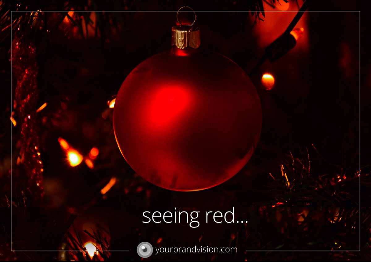
We are almost in December – the big month of red! Other colors have been added to the Christmas palette over time. Silver and gold are close companions to all Christmas colors. However, I don’t think anyone in our western culture can think of Christmas without seeing and “feeling” red with our inner eye. Unfortunately, the pressure (from where exactly?) of having the “perfect” Christmas makes some people stress out and “see red” in another way, but mostly I think the “red feeling of Christmas” is cozy, warm and near. This not only something cultural and psychological. Our physical vision experiences red as being “nearer” than other colors. Blue is the color that is perceived to be furthest way from us. This is useful knowledge if we are adding a background color in a visual expression. It is hard to make a red background appear to be “behind” other elements. Try for yourself. A blue background on the other hand, will willingly place itself in back, all by itself.
The western Christmas phenomenon OWNS red, we recognize the season by its color. With a bit of humor, one can say that “the Christmas chief designer” has done a great job on the visual branding 🙂 Christmas cannot be mistaken for something else. We can learn a thing or two from this. It is all about visual consistency, for what it’s worth. And in the case of Christmas the worth is quite substantial, as we know…
COMPLEMENTARY COLORS
Color theory talks of something called “complementary” colors. Easily explained the complementary color is the “opposite” of a given color. The complementary color to red is green, a color that is also used very much for Christmas. Complementary colors enhance each other well and are often used together. There is however a great pitfall regarding complementary colors that we need to be aware of. INTERFACE. When two complementary colors are placed side by side without being separated by white or another color, they will start to fight for the attention of your eye. Where they meet, a sort of “edge” will emerge that makes your vision flicker uncomfortably. This is interference.
Be aware in this red and green season not to place the two colors to close to each other. Interference does not add to the cozy feeling of Christmas! It is a challenge to know where to start, if you want to work with the visual branding and graphic design for your business. Let’s have a talk on Skype or telephone to see how I can help you, starting at the point you’re at right now. I am curious about what you have to say. There is no cost for this call. Book a call by sending me an e-mail on: hanne@yourbrandvision.com