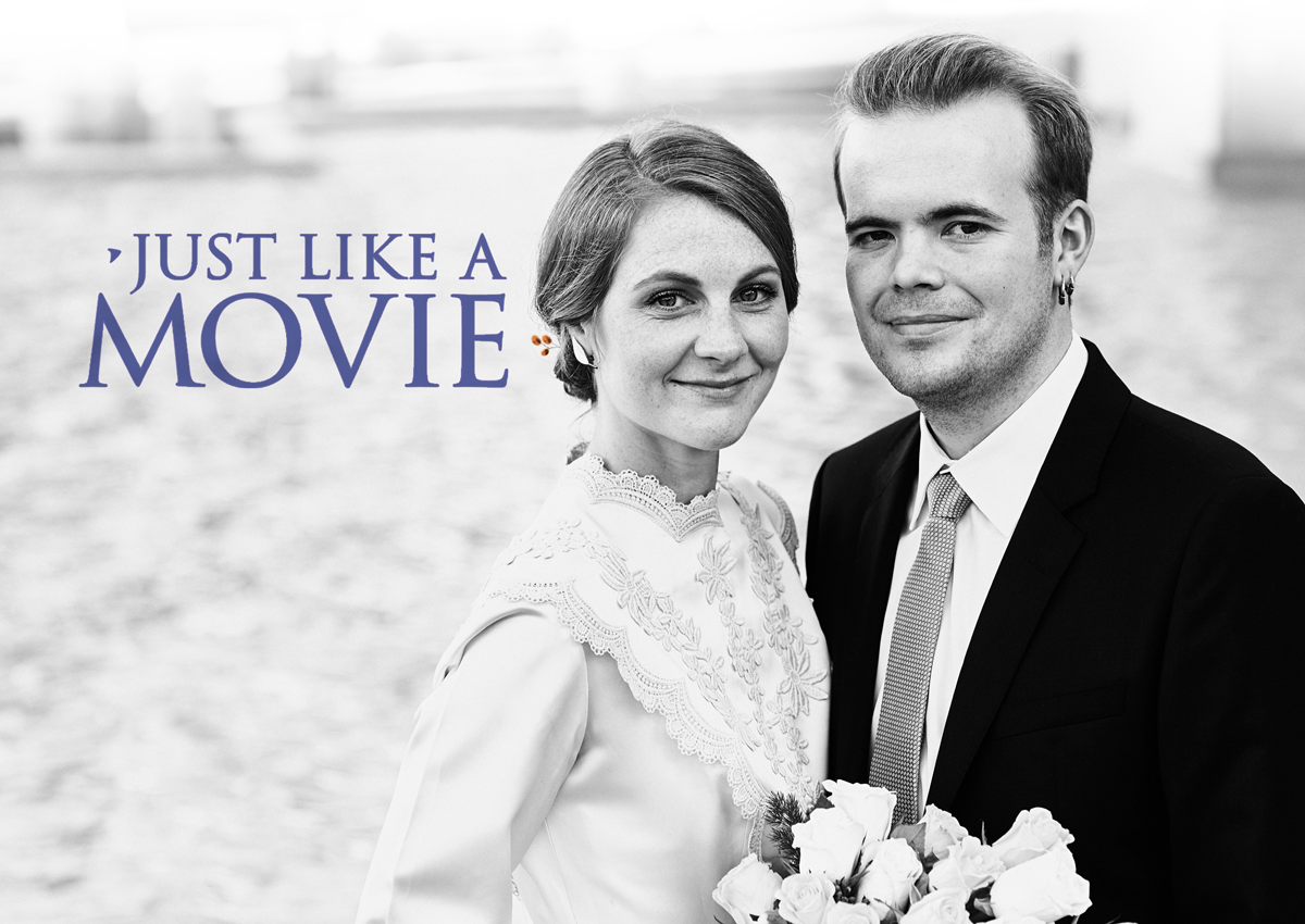
I have just returned from a journey to Italy where my youngest son Øyvind got married to his dear Ellen at the Norwegian Embassy in Rome. Of course, the wedding and all activities connected to it, was the main purpose and top priority of the trip. Even if it was my first ever visit to Rome, I had no plans to spend any time queuing to get into some “obligatory” main attraction – they will have to wait for me until next time.
There was, however, ONE special thing that I would very much like to see this time around, and that was the Trajan’s Column. This column was erected in the years 107-113 BC in memory of the victory of Emperor Trajan in the “Dacian Wars.” An event so important to his contemporaries that they elected to raise this very impressive monument in honor of it. To the posterity, and especially to the font nerds among us, the importance of Trajan’s Column has mainly been as a (literally) towering memorial within the history of typography. The inscription at the base of the column is regarded as showing the optimal version of the “Roman Square Capital” – or “uppercase letters” as we say today. Chiseled masterly into the stone, this inscription has inspired many font designers throughout the centuries to create versions of the Roman letterforms suited to their own times and technologies.
Someone who has REALLY succeeded in this effort is Carol Twombley, font designer with Adobe and the creator of the font “TRAJAN” (1989). You most certainly know this font very well (even if you might not be aware of it). There is hardly a movie poster designed after 1989 that does NOT use this font! In fact, there are so many using it, that some folks have made it the object of research, and others, the object of annoyance. If you know what you are looking for, you will certainly notice it hereafter. It is unfortunately not possible to get as close to the Trajan’s Column as to be able to study the letterforms in detail. Luckily, almost the same type of letters can be observed on the Pantheon and other monuments and buildings in Rome.
The letterforms from the Trajan’s Column are, however, the only ones who have completed this remarkable journey in time – over nearly 2000 years. The letterforms of “TRAJAN” have established themselves as THE obvious typographic representative of a kind of entertainment that the old Romans, accustomed as they were to blood and circus, could not have envisioned even in their wildest fantasies! It is a challenge to know where to start, if you want to work with the visual branding and graphic design for your business. Let’s have a talk on Skype or telephone to see how I can help you, starting at the point you’re at right now. I am curious about what you have to say. There is no cost for this call. Book a call by sending me an e-mail on: hanne@yourbrandvision.com


Dear Hanne!
Your posts are always so inspiring and interesting to me. In my business journey I have found it is so important for me to have clarity in the message that I want to transmit… I am almost there. And as soon as I have it defined, even if it is not completelly, I know I want to work with you!
Congratulations for your son’s wedding!
Heidi
Dear Heidi! Thank you so much for your comment, it means a ton to me! Good luck on your work and please let me know if and when I can help you! All The Best, Hanne