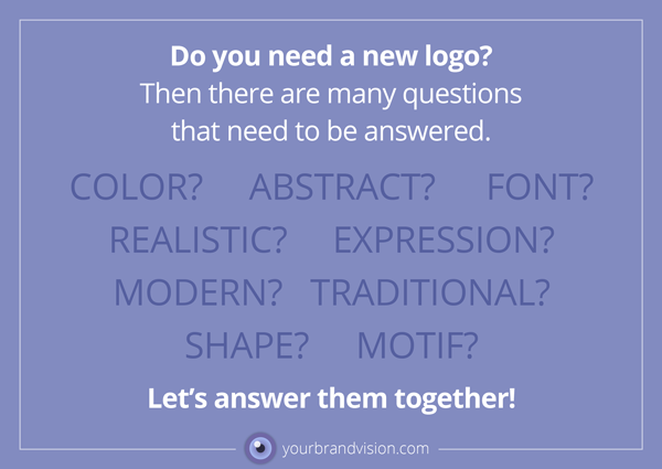
Do you need a new logo? Then many questions need to be answered. How will it look? Where to find inspiration and information that can point out a visual direction? Co-creation between the designer and the soon-to-be logo owner is crucial in my opinion. The logo should emerge from the unique personality, values, and visions of the business. In my book “Brand BoxesTM, Your 9-step process to creating a visually compelling brand“ I talk about how we can work just in the “transit” between a verbal description of a business, and the concentrated visual expression of a logo. I will not pretend that this is easy, but I will not avoid pointing out the excitement and learning benefits of such a process, for both parties involved.
In my book, you will find the “mind-map” that I used when circling in the “eye” in my own logo.
You can, of course, buy finished logos from providers across the internet. They all have that in common that they have materialized without you as the new logo-owner having contributed zero.
2019 gave me the opportunity to work closely with some soon-to-be logo owners.
The year also gave me opportunities to work more with books, which as a book worm I am very happy to do. I am grateful to have been trusted with the assignment of creating a logo for a new Publishing House. My editor and constant verbal support person within the English language, Debby Kevin, came out of 2019 making her publisher dream a reality, establishing her very own “Highlander Press”. If you get Scottish vibrations, that’s correct. Debby —“a wee lassie” wishes to honor her national background in the name of her new publishing house.
There was no lack of ideas. We had the entire “book-theme” to tap from, we had ideas about old-fashioned printing presses and the entire beauty of the Scottish nature. And these things in combination, of course. In addition, Debby is in love with the look of Britain ala 1920 and would very much like to work that into whatever we landed on.
Drawing, thinking and drawing again. It is important to use any possible resources of information and inspiration you can think of. One evening I was with very good friends, who have been traveling in Scotland every summer for several years. So it would have been stupid not to ask: What do you think of as a typical visual symbol for Scotland? The answer came quickly: the Thistle, the national Scottish national flower. With this even more visual possibilities came to mind. I went home and started to draw thistles. This is the result:
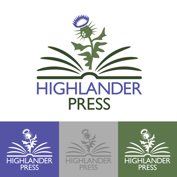
The font being used is Gill Sans. It was created by Eric Gill in 1928 and has dripped into our consciousness as something typically British after being used by British Railways, Penguin Books and BBC, among others.
It does not follow that one loves purple, even if one wants a thistle in one’s logo. We have adjusted the color towards lavender blue, without damage to its thistly appearance.
Debby is very happy with her logo, and the first book to be published with the thistle on its cover and title page is just around the corner.
A logo process invites the soon-to-be logo owner to co-creation, reflection, and renewed consciousness. It also secures solid ownership to the most important visual symbol of the business.
Please let me know if you want to talk about a logo process for your business!