Do you keep in touch with people via an e-mail newsletter, or do you plan to?
Regardless of which e-mail newsletter service you’ve decided to use, there are things that can be good to know, and I have made this list for you:
1. E-mail newsletters are HTML-based, which means we cannot control how they will look to 100%. Your e-mail newsletter program (like Mail Chimp, GetResponse or others) describes your content in code, which is read in by the e-mail client (Google-mail, Mac-mail Outlook or others) the receiver uses to read his e-mail. Unfortunately, the e-mail clients do not agree on how to interpret the HTML-code, and that is why you can never be completely sure how your letter will look in your reader’s inbox.
2. Make it simple. One way to avoid different interpretations of the HTML-code is to make the newsletter as simple as possible. Avoid text in columns, many different fonts, and font-sizes, and text wrapping (- that is trying to place an image within a text flow).
3. When creating a template for your newsletter, choose a width in pixels and let it always be the same. Let your text blocks have only one column, but use generous margins so the text doesn’t threaten to burst its block. The margins in this newsletter are 40 pixels.
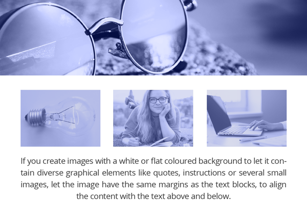
4. Images can have the same width as the textboxes and the letter itself. This makes them well suited as separators between topics and paragraphs in the letter. If you create images with a white or flat colored background to let it contain diverse graphical elements like quotes, instructions or several small images, let the image have the same margins as the text blocks, to align the content with the text above and below.
5. Fonts. E-mail newsletter programs have only a few fonts to choose from. Use the font among these which you find best represents the personality of your business and brand. My newsletters have been set with Trebuchet for years. My profile font Open Sans is not available in Getresponse, which I use. If I had suddenly started to address you in another font you would certainly have wondered if it was really me writing.
6. Use short paragraphs.Reading text on a screen is very hard on the eyes. More white space in the text flow makes it easier to read, understand and remember the content.
7. Use your brand’s colorsand image style in the visuals. Remember visual consistency. We want to recognize your business across all touchpoints. This is especially important in the header, which is the first thing the reader sees. You can also use your profile font in the header. Because it is an image, and the font has been “frozen” into the image as pixels, you are not restricted by the narrow selection of fonts in the e-mail program.
Please contact me if you need help getting off the ground with your e-mail newsletters.