Have you ever been tempted to download a free e-book or a so-called “lead magnet”? I know I have, many times. Of course, you have to “pay” for the book by giving away your e-mail address. This way the publisher of the e-book can get you into her e-mail list and send you newsletters, offers and other things that will be of interest to you, – or not. I do this myself. Perhaps the reason you are reading this right now is that you once opted in to read MY e-book. I hope you were not disappointed.
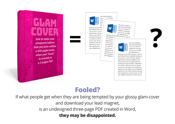
I am very often disappointed when downloading e-books. Somehow, it has become acceptable to “dress up” the visualization of e-books on web sites and social media, to look like thick hardcover books with dust jackets and all. I call these glossy glam covers. When what reveals itself on the download link turns out to be a lethargic PDF from Microsoft Word, devoid of any attempt on design or branding, not to mention illustrations, I feel the urge to read and learn (that made me want to download the e-book in the first place) quickly vaporize.
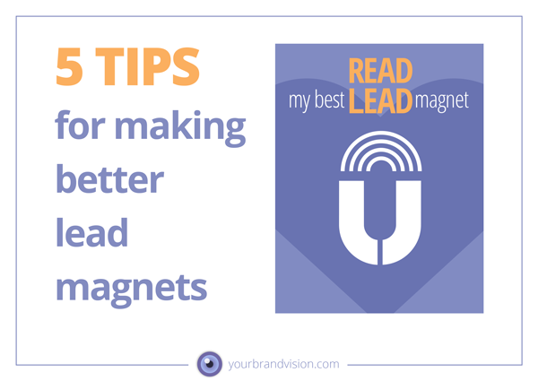
If you have written a lead magnet in the form of an e-book or are planning to do so, I have these 5 tips for you:
1. Let there be as much realism as possiblebetween how the book is visualized on your web site or in social media, and how it looks IRL. Let the format and proportions be the same, and don’t disguise your book as a 300-page popular science book in hardcover.
2. Microsoft Word is a digital typewriter, NOT a layout program. Ask a graphic designer to create your book in a professional layout software like Adobe Indesign.
3. If you have tools, methods or structures in your offer, let your graphic designer help you visualize these in a simple, attractive way. Give her the color codes of your brand colors so she can use them (and tints of them) in the graphics. This will make your offer and e-book unique.
4. Consider the format. Will your book be read on-screen or more likely printed? To show an entire letter-sized page in portrait format on a small laptop screen, will make the text tiny and hard to read. Of course, you can zoom in, but it’s annoying to scroll a PDF within a page because Acrobat Reader tends to jump to the next page when you reach a certain point on the page. (I have just finished reading an e-book of 200 plus pages in portrait format on screen, and at the end, I was SICK of having to scroll back up to read the lower 1/3 of the previous page).
If you know that your e-book will primarily be read on-screen, use a landscape format. Computer screens are in landscape format and will contain an entire letter-sized page without any need to scroll. In a letter-sized format in portrait orientation text lines that span the entire width of the page, will be much too long for comfortable reading. Use 2/3 of the width for a text column and leave the last 1/3 for illustrations, graphics or quotes. Or simply some white space, to let the page breathe.
5. Save ink!! It is tempting to make pages and covers using big images in full color, or solid backgrounds in shining colors. The PDF format is great for rendering such visuals – on screen. The backlit (RGB) colors look magnificent – on screen. When printed out the pages are reduced to wet rags of matte color and the reader’s printer soon runs out of ink. If you have reason to believe that your e-book will more likely be read with highlighter or pencil in hand, create “light” pages and covers that will save some ink for your readers.
If you consider making a professional-looking lead magnet with customized graphics, give me a call. I would love to help you spread your important message!

These are great tips. Thank you!
Thank you Judy!
Hanne, this is really good advice! Thank you!
I love the perspective you share here, Hanne! Things that I had not thought of when I made lead magnets in the past. I will certainly keep these tips in mind as I begin to plan my next lead magnet. Thank you!!
Thank You Kelly!
Thank You, Maribeth!