Happy New Year!
It is that time of the year again. With new years resolutions and renewals. Regarding the personal side of these things, most of us are very conscious. We care about our health and how we look. But what about your business? Will it stand a closer look in the mirror?
Here are 3 tips for businesses of all sizes who want to look at themselves in the mirror with more self-confidence. Remember that what we see in the mirror is what our potential clients and customers always see.
1. DECLUTTER
I have a blog post called Touchpoint Christmas Cleaning. If you didn’t manage to do a declutter of your business’ touchpoints before Christmas, no time is better than the present. Go through all of your visual touchpoints and wedge out things that no longer show your business in a way that you want it to be seen. This is especially important if you have been in business for quite a while if you have not had a visual guide (brand book/graphic profile) to support you, or in cases where no one has had the overall responsibility for the visual appearance of the business, neither digitally nor in print.
2. FACELIFT
When decluttering, you will find things that should not be trashed, but which need a facelift. We live in a world where things change very fast. Even with a brand book (visual guide, graphic profile) to guide you, you will feel the need for visual renewal. Is there compliance between content and appearance? Colors and fonts may stand the wear and tear of time very well, but images, graphics, and style of presentation may need an upgrade to seem up to date? This does not mean that the entire brand needs to be changed. Things that may need a facelift may include: single pages on your website, social media headers and post images, newsletter templates, and product sheets and flyers.
3. MORE COMPREHENSIVE CHANGES
You may find that some parts of your visual branding may be in need of a more “total makeover”. Many small businesses have been in action since before the internet and the digital age. Most of them have logos that were created without the limitations and demands that we need to consider today. I see an awful lot of logos out there in dire need of a make-over in order to match the requirements of a modern logo. Even so, we need to remember that consistency is the core of visual branding.
Even if the logo needs to be redesigned, we can look for visual elements to be continued in order to still recognize the business in a re-drawn logo.

1. The starting point – an impractical and old-fashioned logo.
In my opinion, to juggle 2 different fonts in the same logo is something for the real experts. In this case, there are even 3 fonts, and the result is not good.
The font “Brush” which is used in the word “Gilbert” was created in 1942 and was over-used by the advertising business until worn out in the sixties. It is seriously out of date and signals that the user is very much “lost in time”. It has scored high on lists of “the worst font ever” and is not something anyone wants to be associated with.
The width of the logo makes it look like a strange insect when rendered in a circular profile image or small spots on the internet.

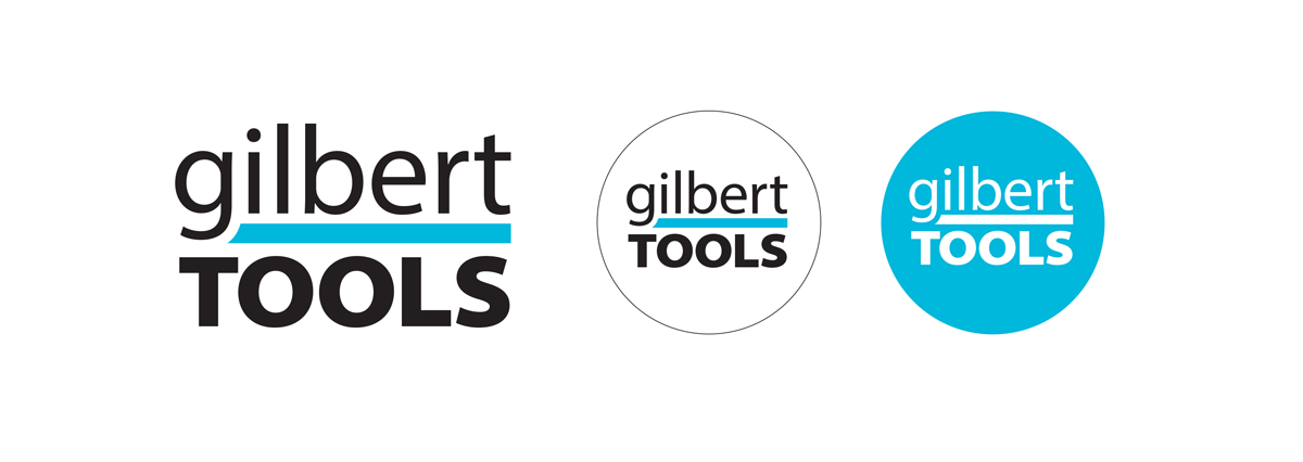
2. Attempt at renewal. What can we take with us from the old logo? There is a characteristic feature where the letters G and J plunge into the thick colored line. I think this will (more or less consciously) bring the old logo to mind. And of course, the cyan signal color is the same. By shortening the name and setting it directly above the word TOOL (which is still all uppercase like before) the logo has gained an almost square shape and fits well into a circular profile image and will take up less space where ever it is placed. A negative (white) version makes the logo even easier to use.


