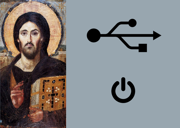
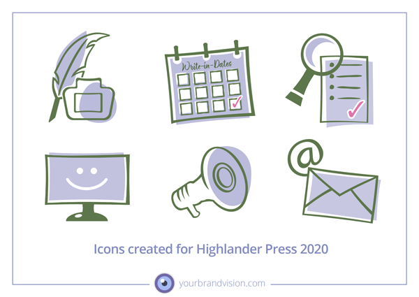
Icons came to Graphic Design and visual communication via computer language where they are small symbols representing functions. At this time, icons are everywhere, from packaging to the apps on your phone. Like the hieroglyphs of ancient Egypt they form their own visual language, based on similarity and common visual understanding. Some icons have become generic.

If you wish to use icons in your visual communication, you have a few choices. Icons can be bought in pre-made collections from all major stock-photo bases. The challenges regarding these icons are:
It may be difficult to find icons that can represent your content precisely, it being a service, a course or a product. Please remember that the original meaning of the word icon is “to be like”. If people have to guess to find the connection between your content and the icon representing it, communication is made harder, not easier.
Even if you DO find a collection from which you can use some of the icons, you still may have to search other collections to find the rest. Some icon creators have responded to this need and created icon collections in the same style for many different niches and topics. But even so, it can be difficult to find collections in the same style containing everything you need.
Do not mix icons from different collections. This generates visual noise and tells the word that you don’t know a thing about consistency.
Don’t count on being the only one using icons bought from bases. You have no guarantee that your competitor will not emerge with the same icons the next day…

If you want to have a chat about icons and how to use them in your business, let’s have a virtual coffee date on Zoom, you can book one here.


