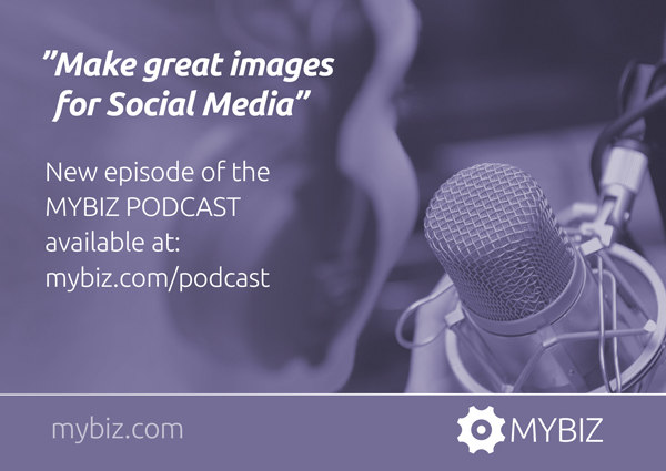
Images are very popular on social media, and get more likes and shares than text updates. They are useful and fun to make.
Images can contain quotes, tips & tricks from your industry, snapshots from your office, workshop or meeting with clients (if they agree), and anything else you may think of – all of these types of images are great content to share on social media. Also, it’s great if your images can give people value or help them in some way.
Make sure that you brand these visuals. Use your brand colors in the texts, backgrounds and graphical elements. Use your font consistently, and always have your logo in the same position in the image if possible, clearly, but discreetly. This is when it comes in handy to have versions of your logo in one color, preferably black or white, to go on the images. Also, you may want to have the URL of your website in the image as well.
The images cannot be linked to anything but themselves, but, if you have a comment in the update/post, you can link to your website from there. You may use your branded images on Facebook, LinkedIn (be professional!), Twitter, Pinterest and Google Plus. Pay attention to the different sizes requested currently.
If you use the same size/format on images for all channels, they might get cropped or cut off to the default size of shared images on that specific channel. You will either have to cope with that and assume that people will click through to see your entire image once they see part of it, or you will have to create images specifically for each channel, which may be time-consuming. Again, you don’t have to be present on all social media channels. Stick with the ones where you will most likely meet your target audience. And, be consistent on the social media channels where you decide to be present.
The branded post images on social media tell a story about your brand and it makes a great difference how they are designed. Think ahead and make a style manual for your branded images. You may have different “categories” of branded images, which may have different looks within the overall branding. Inspirational quotes may have one look and images of you from your office or with clients may have another look within the same branding.
Post/update types of images for organic sharing have no limit to them as to how much text you wish to use. Ads, on the other hand, cannot have very much text in them before it decreases their chance of being seen.
The Facebook text overlay tool will let you see in advance how well your ad will be displayed based on the amount of text in it.
As for design and typography, you should always use the guidelines that we have worked with here regardless of your image being an ad or not.
Here is a link to a page where you can find lots of tools that you can use to create images. Don’t go bananas and do EVERYTHING that is possible with the tools just because it is possible! Have your core brand message in mind, plan ahead and stay consistent.
In this blog post, I have written about the two important means of communication, images and text, and how you can avoid having them conflict with each other and potentially decrease the value of your communication.
Good luck with your branded images! It is a challenge to know where to start, if you want to work with the visual branding and graphic design for your business. Let’s have a talk on Skype or telephone to see how I can help you, starting at the point you’re at right now. I am curious about what you have to say. There is no cost for this call. Book a call by sending me an e-mail on: hanne@yourbrandvision.com


